

A name with meaning and a brand book.
We positioned VERSUS for women who already take their training seriously. They didn't need another brand telling them to push harder. They wanted activewear that matched the standards they already hold themselves to.
The name already held that idea. You vs. your limits. You vs. yesterday. Training vs. recovery.
We developed the visual identity, from four logo directions to the final wordmark, and defined the brand's tone of voice in a brand book. The statement "Designed for women who expect more from what they wear" brought the positioning together.
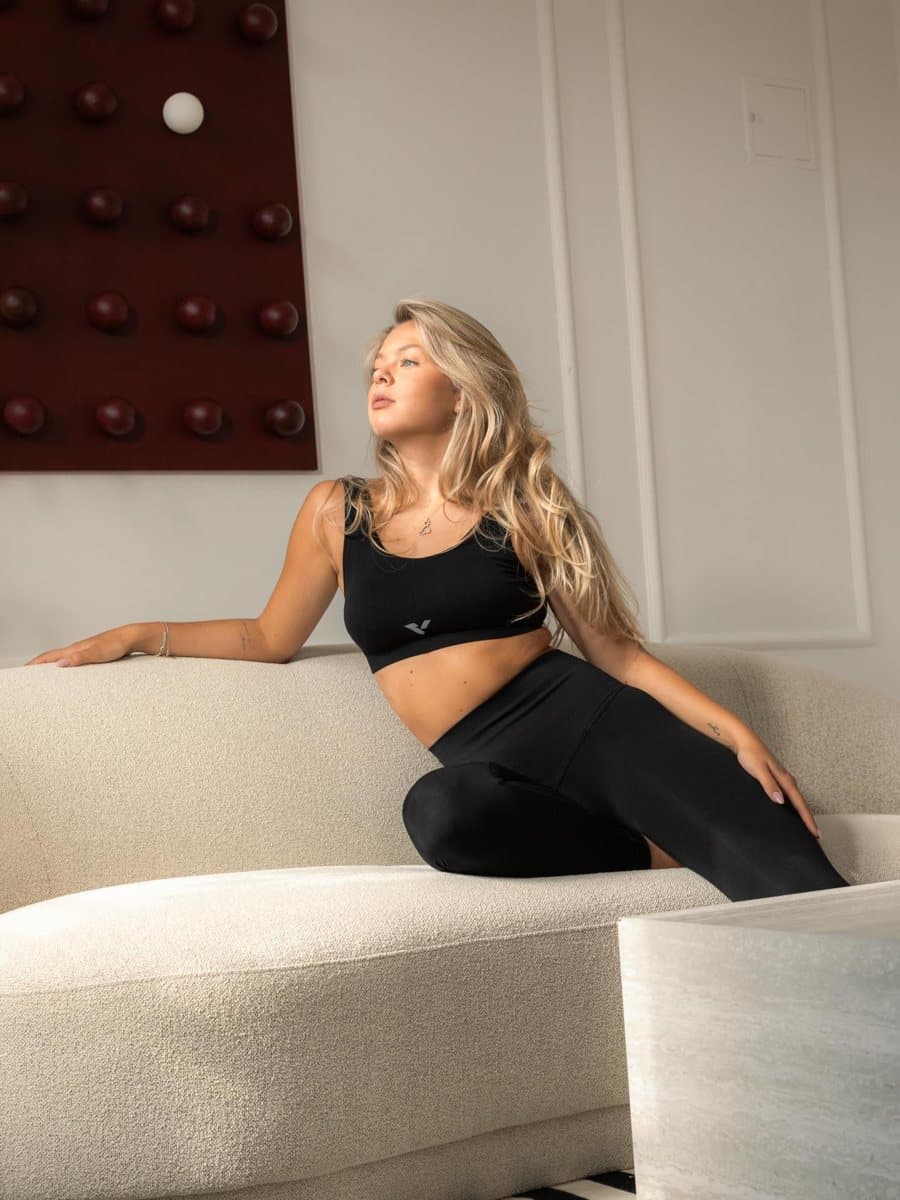
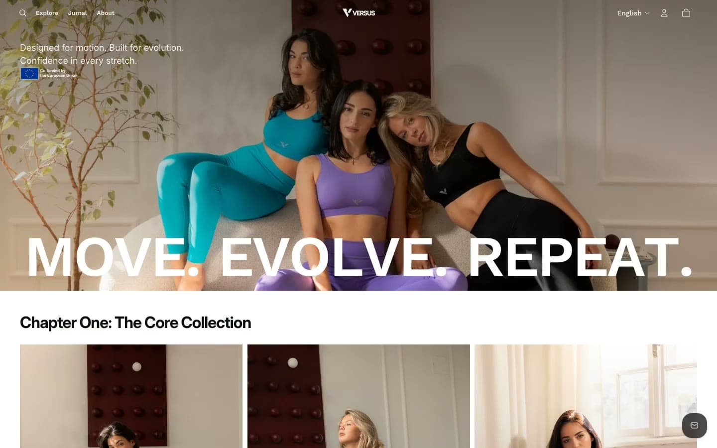
Collection 01 became three states of the same woman, black for discipline, purple for recovery and aqua for flow.